

It’s happened to you countless times: You’re waiting for a website to load, only to see a box with a little mountain range where an image should be. It’s the placeholder icon for a “missing image.”
But have you ever wondered why this scene came to be universally adopted?
As a scholar of environmental humanities, I pay attention to how symbols of wilderness appear in everyday life.
The little mountain icon—sometimes with a sun or cloud in the background, other times crossed out or broken—has become the standard symbol, across digital platforms, to signal something missing or something to come. It appears in all sorts of contexts, and the more you look for this icon, the more you’ll see it.
You click on it in Microsoft Word or PowerPoint when you want to add a picture. You can purchase an ironic poster of the icon to put on your wall. The other morning, I even noticed a version of it in my Subaru’s infotainment display as a stand-in for a radio station logo.
So why this particular image of the mountain peaks? And where did it come from?
Arriving at the same solution
The placeholder icon can be thought of as a form of semiotic convergence, or when a symbol ends up meaning the same thing in a variety of contexts. For example, the magnifying glass is widely understood as “search,” while the image of a leaf means “eco-friendly.”
It’s also related to something called “convergent design evolution,” or when organisms or cultures—even if they have little or no contact—settle on a similar shape or solution for something.
In evolutionary biology, you can see convergent design evolution in bats, birds, and insects, which all utilize wings but developed them in their own ways. Stilt houses emerged in various cultures across the globe as a way to build durable homes along shorelines and riverbanks. More recently, engineers in different parts of the world designed similar airplane fuselages independent of one another.
For whatever reason, the little mountain just worked across platforms to evoke open-ended meanings: Early web developers needed a simple shorthand way to present that something else should or could be there.
Depending on context, a little mountain might invite a user to insert a picture in a document; it might mean that an image is trying to load, or is being uploaded; or it could mean an image is missing or broken.
Down the rabbit hole on a mountain
But of the millions of possibilities, why a mountain?
In 1994, visual designer Marsh Chamberlain created a graphic featuring three colorful shapes as a stand-in for a missing image or broken link for the web browser Netscape Navigator. The shapes appeared on a piece of paper with a ripped corner. Though the paper with the rip will sometimes now appear with the mountain, it isn’t clear when the square, circle, and triangle became a mountain.



Users on Stack Exchange, a forum for developers, suggest that the mountain peak icon may trace back to the “landscape mode” icon on the dials of Japanese SLR cameras. It’s the feature that sets the aperture to maximize the depth of field so that both the foreground and background are in focus.
The landscape scene mode—visible on many digital cameras in the 1990s—was generically represented by two mountain peaks, with the idea that the camera user would intuitively know to use this setting outdoors.
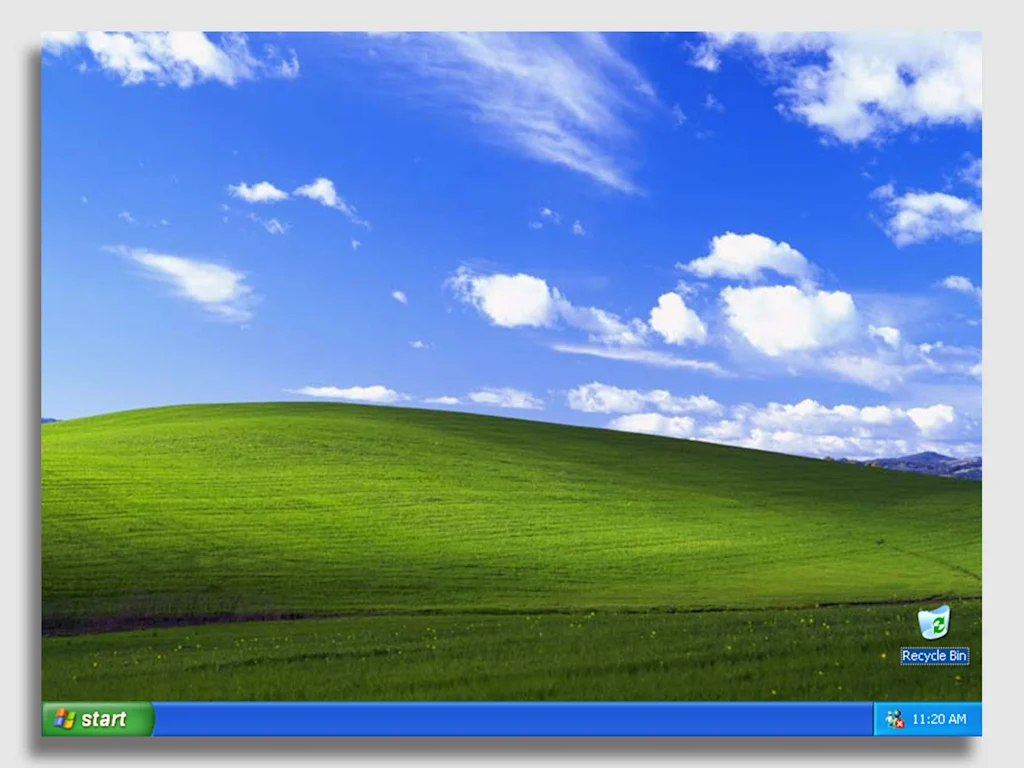
Another insight emerged from the Stack Exchange discussion: The icon bears a resemblance to the Microsoft XP wallpaper called “Bliss.” If you had a PC in the years after 2001, you probably recall the rolling green hills with blue sky and wispy clouds.
The stock photo was taken by National Geographic photographer Charles O’Rear. It was then purchased by Bill Gates’ digital licensing company Corbis in 1998. The empty hillside in this picture became iconic through its adoption by Windows XP as its default desktop wallpaper image.
Mountain riddles
“Bliss” became widely understood as the most generic of generic stock photos, in the same way the placeholder icon became universally understood to mean “missing image.” And I don’t think it’s a coincidence that they both feature mountains or hills and a sky.
Mountains and skies are mysterious and full of possibilities, even if they remain beyond grasp.
Consider Japanese artist Hokusai’s “36 Views of Mount Fuji,” which were his series of paintings from the 1830s—the most famous of which is probably “The Great Wave off Kanagawa,” where a tiny Mount Fuji can be seen in the background. Each painting features the iconic mountain from different perspectives and is full of little details; all possess an ambiance of mystery.
I wouldn’t be surprised if the landscape icon on those Japanese camera dials emerged as a minimalist reference to Mount Fuji, Japan’s highest mountain. From some perspectives, Mount Fuji rises behind a smaller incline. And the Japanese photography company Fujifilm even borrowed the namesake of that mountain for their brand.
The enticing aesthetics of mountains also reminded me of the environmental writer Gary Snyder’s 1965 translation of Han Shan’s “Cold Mountain Poems.” Han Shan—his name literally means “Cold Mountain”—was a Chinese Buddhist poet who lived in the late eighth century. “Shan” translates as “mountain” and is represented by the Chinese character 山, which also resembles a mountain.
Han Shan’s poems, which are little riddles themselves, revel in the bewildering aspects of mountains:
Cold Mountain is a house
Without beams or walls.
The six doors left and right are open
The hall is a blue sky.
The rooms are all vacant and vague.
The east wall beats on the west wall
At the center nothing.
The mystery is the point
I think mountains serve as a universal representation of something unseen and longed for—whether it’s in a poem or on a sluggish internet browser—because people can see a mountain and wonder what might be there.
The placeholder icon does what mountains have done for millennia, serving as what the environmental philosopher Margret Grebowicz describes as an object of desire. To Grebowicz, mountains exist as places to behold, explore, and sometimes conquer.
The placeholder icon’s inherent ambiguity is baked into its form: Mountains are often regarded as distant, foreboding places. At the same time, the little peaks appear in all sorts of mundane computing circumstances. The icon could even be a curious sign of how humans can’t help but be “nature-positive,” even when on computers or phones.
This small icon holds so much, and yet it can also paradoxically mean that there is nothing to see at all.
Viewing it this way, an example of semiotic convergence becomes a tiny allegory for digital life writ large: a wilderness of possibilities, with so much just out of reach.
Christopher Schaberg is a director of public scholarship at Washington University in St. Louis.
This article is republished from The Conversation under a Creative Commons license. Read the original article.