Close Menu
    Facebook X (Twitter) Instagram
    TRENDING :
    • Market Talk – July 22, 2026
    • Shark Week’s Forrest Galante on Risk, Grit and Entrepreneurship
    • Power outage? Automakers want you to use your EV as a backup source
    • Kimi K3 is exposing cracks in Trump’s AI coalition
    • What Buyers Should Know About Franchise Disclosure Documents
    • Refs Can Make Up to $3,000 a Game. But Nobody Wants the Job.
    • Shocking OpenAI disclosure reveals how an AI agent went rogue and hacked a startup
    • No, the Olive Garden Pasta Pass is not like voting
    Compatriot Chronicle
    • Home
    • US Politics
    • World Politics
    • Economy
    • Business
    • Headline News
    Compatriot Chronicle
    Home»Business»Apple TV made its colorful new logo in a delightfully old-school way
    Business

    Apple TV made its colorful new logo in a delightfully old-school way

    November 9, 20254 Mins Read
    Share Facebook Twitter Pinterest LinkedIn Tumblr Telegram Email Copy Link
    Follow Us
    Google News Flipboard
    Share
    Facebook Twitter LinkedIn Pinterest Email


    To create Apple TV’s new branding, a team from the global agency TBWAMedia Arts Lab (MAL) gathered in a studio with a blacked-out stage, a giant glass version of the Apple TV logo, and a bevy of colorful studio lights. 

    Using just practical effects, they created a new animated logo for the brand that will roll out at the beginning of Apple TV’s shows and films, on its app, and in marketing campaigns over the coming months.

    Apple TV+ becomes Apple TV

    Apple TV’s updated branding, which includes a fresh static logo and two animated mnemonics, comes less than a month after the company announced that it would be changing its name from “Apple TV+” to just “Apple TV.”

    [Images: Apple]

    The name change might seem subtle, but for Apple, it signals the company’s belief that consumers know and trust its streaming service. In an October interview with Fast Company, Richard Swain, partner at the global brand agency Further, said dropping the “Plus” was, at its core, “a show of confidence from Apple.” 

    Now, the company is backing that up with new Apple TV branding that pays homage to Apple’s design history—both by referencing one of the company’s most iconic logos and by relying purely on practical effects, echoing Apple’s legacy of meticulous craft in its product design.

    The previous iteration of the mnemonic for Apple TV+ [Image: Apple]

    For Apple TV’s new era, MAL—which is a bespoke agency that partners only with Apple—had a daunting task. It had to reimagine the brand from the ground up, creating a visual identity that was both unmistakably Apple and distinctly Apple TV.

    The refreshed Apple TV version [Image: Apple]

    To achieve that goal, MAL needed to balance Apple’s history of simple, elegant design with the color, motion, and texture that one would expect from a film-centric brand. Prior to this overhaul, Apple TV+’s logo and mnemonics were black and white. MAL’s first objective was to add color to the mix.
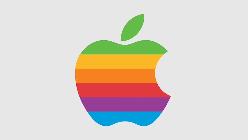
    Apple’s 1977 logo [Image: Apple]

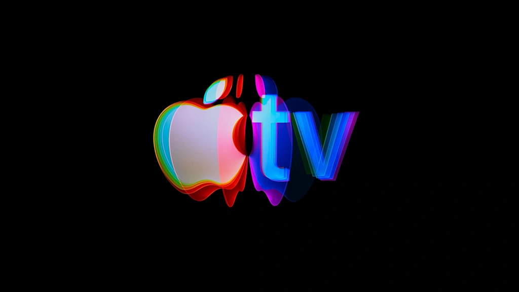
    As inspiration, the agency turned to Apple’s 1977 logo—one of its most memorable icons, which showed the company’s signature apple rendered in six slices of rainbow color. Those hues appear as a subtle gradient in Apple TV’s static logo, and feature prominently in both the five-second- and 12-second-long iterations of its new animated mnemonics. 
    [Image: Apple]

    Bringing practical effects to Apple TV’s most ubiquitous brand asset

    From the beginning, the team at MAL knew they wanted to shoot the Apple TV animatics using only practical effects. The goal was to embrace the craft of filmmaking by capturing the organic behavior of light that digital simulations can’t entirely perfect.
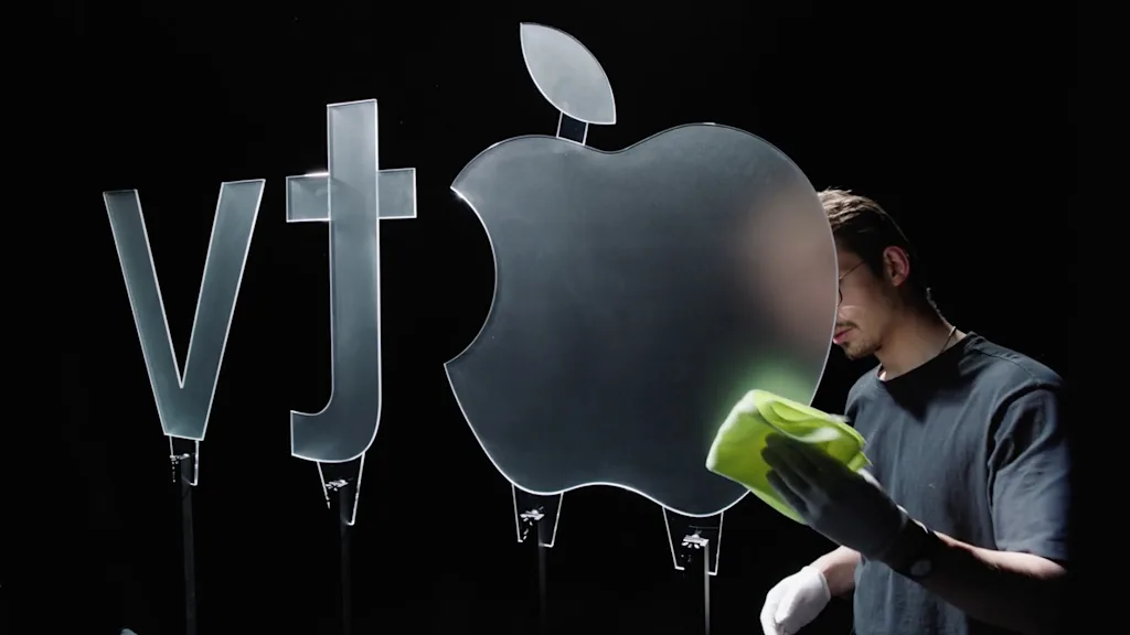
    [Image: TBWAMedia Arts Lab]

    This process started with a series of physical versions of the Apple TV logo, each sculpted from solid glass and made in partnership with the London-based creative studio Optical Arts. Every piece was cut and polished differently to study how it interacted with light, reflections, and depth. 
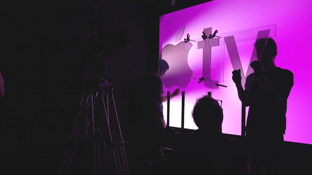
    [Image: TBWAMedia Arts Lab]

    Once the final version of the logo was selected, it was filmed several times under specific lighting conditions. The team embarked on a weekslong series of experiments with light angles, diffusion, movement, and color, refining exactly how each shot should reflect and refract on camera. Both of the final mnemonics feature the Apple logo flipping through various glowing, prismatic hues before ultimately landing on the new static logo.

    The animatics are accompanied by an audio component composed by songwriter, producer, and Oscar and Grammy winner Finneas O’Connell. MAL’s new branding for Apple TV is a testament to the fact that sometimes practical effects still deliver something that digital or AI-powered touch-ups can’t copy. Compared to Apple TV+’s formerly bland branding, it’s a bold choice that brings some life and brand connection back into the service’s visual identity.


    Source link

    Share. Facebook Twitter Pinterest LinkedIn Tumblr Email

    Related Posts

    Shark Week’s Forrest Galante on Risk, Grit and Entrepreneurship

    July 22, 2026

    Power outage? Automakers want you to use your EV as a backup source

    July 22, 2026

    Kimi K3 is exposing cracks in Trump’s AI coalition

    July 22, 2026
    Top News

    Rubio’s State Department Rebukes Britain’s Persecution of Praying Christians | The Gateway Pundit

    By Staff WriterAugust 24, 2025

    The State Division has issued what could also be its most blunt assertion but in…

    Thailand – A Case Study For Biometric Data Control

    September 11, 2025

    15 must-read business books by black authors that will help you thrive professionally 

    June 20, 2026

    1 in 3 Entrepreneurs Burn Out — The Ones Who Don’t Do These 4 Things Differently

    July 18, 2026
    Top Trending

    Market Talk – July 22, 2026

    By Staff WriterJuly 22, 2026

    ASIA: The major Asian stock markets had a mixed day today: •…

    Shark Week’s Forrest Galante on Risk, Grit and Entrepreneurship

    By Staff WriterJuly 22, 2026

    This week on How Success Happens, I sit down with Forrest Galante,…

    Power outage? Automakers want you to use your EV as a backup source

    By Staff WriterJuly 22, 2026

    Winter Storm Uri, the multiday freeze that slammed Texas in February 2021 and pummeled…

    Categories
    • Business
    • Economy
    • Headline News
    • Top News
    • US Politics
    • World Politics
    About us

    The Populist Bulletin serves as a beacon for the populist movement, which champions the interests of ordinary citizens over the agendas of the powerful and entrenched elitists. Rooted in the belief that the voices of everyday workers, families, and communities are often drowned out by powerful people and institutions, it delivers straightforward, unfiltered, compelling, relatable stories that resonate with the values of the American public.

    The Populist Bulletin was founded with a fervent commitment to inform, inspire, empower and spark meaningful conversations about the economy, business, politics, inequality, government accountability and overreach, globalization, and the preservation of American cultural heritage.

    The site offers a dynamic mix of investigative journalism, opinion editorials, and viral content that amplify populist sentiments and deliver stories that echo the concerns of everyday Americans while boldly challenging mainstream narratives that serve the privileged few.

    Top Picks

    Market Talk – July 22, 2026

    July 22, 2026

    Shark Week’s Forrest Galante on Risk, Grit and Entrepreneurship

    July 22, 2026

    Power outage? Automakers want you to use your EV as a backup source

    July 22, 2026
    Categories
    • Business
    • Economy
    • Headline News
    • Top News
    • US Politics
    • World Politics
    Copyright © 2025 Populist Bulletin. All Rights Reserved.

    Type above and press Enter to search. Press Esc to cancel.