
Major League Baseball has some of the most recognizable franchises in the world. But a new league is coming for America’s pastime, letting women into the professional field for the first time in 72 years.
The Women’s Pro Baseball League (WPBL) kicked off its inaugural season on Aug. 1 after the unveiling of the first the league’s first four teams, all named to honor pioneering women: San Francisco Firebells, New York Heights, Los Angeles Queens and Boston Hunters.
“We realized we wanted every team identity to represent something bigger than baseball,” WPBL’s chief marketing officer, Kelly Gianopoulos, tells Fast Company. “While each team has its own distinct personality, they’re all connected by the same spirit of courage, resilience, and challenging expectations.”
The newly established league follows in the footsteps of the All-American Girls Professional Baseball League, which was popularized in the 1990s hit film A League of Their Own. That league brought women to the professional stage for over a decade, but folded in 1954, leaving a vacuum in professional women’s baseball.
While bringing women back onto the field was a massive undertaking, it also opened the doors for a rare occasion: designing a major sports league from scratch.
Creative control
When Justine Siegal, a well-known baseball coach and sports educator, and Keith Stein, a lawyer and sports investor, set out to create the WPBL, they knew they wanted it to operate under a single ownership model to start. This allows the organizers creative control over all aspects of the league, from which markets to prioritize to creating initial naming conventions, uniform design, and overall brand identity.
“Ultimately we will have team owners, but by the time we get there, I think we’ll be very proud of the foundation we’ve put in place,” says Stein, the CEO.
Among the most important decisions was naming the inaugural teams after pioneering women with impacts in their specific domains, a step away from traditional sports names inspired by local folklore, fan contests, or owner preference. Stein says the idea didn’t initially land with all of the league’s decision-makers, but it ultimately stuck.
After brainstorming in house as well as with the league’s players, the WPBL landed on four names, paying tribute to four women. The New York Heights is named after Dorothy Height, dubbed the godmother of the civil rights movement; the Boston Hunters pays tribute to Harriot Kezia Hunt, often referred to as America’s first woman physician; the Los Angeles Queens is inspired by the “Queen of the Diamond,” Lizzie Murphy, the first woman to play against major league players; and the San Francisco Firebells’ name refers to Lillie Hitchcock Coit, a former patron of volunteer firefighters in that city.
“The strategy I landed on was killing many birds with one stone,” Stein says. “It was accomplishing my bigger vision, which was to really inspire people and pay homage to great people, great icons. But also it opened up a whole different type of naming process to us that we could trademark and protect.”
Four teams, four identities
Next came the challenge of creating what the teams would actually look like. For that, the WPBL enlisted the Canadian advertising agency Arrivals + Departures.
“We knew instantly that this was going to be a fairly monumental task. Not necessarily laborious in that sense, but impactful,” says Jeff MacEachern, chief creative officer at the agency. “The genius of the naming convention that they took on . . . was a unifying paradigm that I had not seen before.”
Once the four final names were chosen, the 11-person team got to designing a visual identity, picking up inspiration from the colors of other sports teams in each city, as well as baseball traditions and local aesthetics and icons.
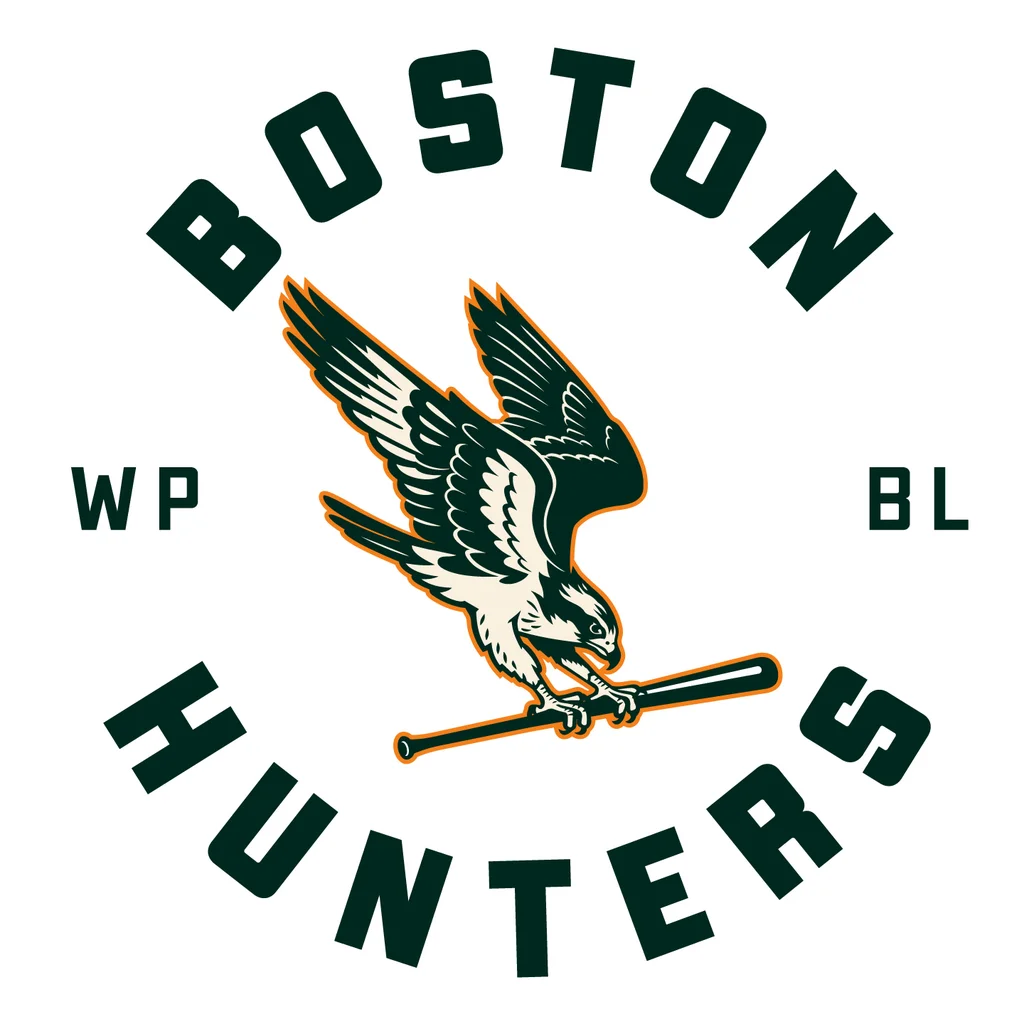
The Boston Hunters’ visual design, for instance, features green as the anchor color—a callback to other sports teams in the city. Its logo depicts a bird, a common theme in baseball teams, but subverts the theme by including a predatory bird chasing the osprey.
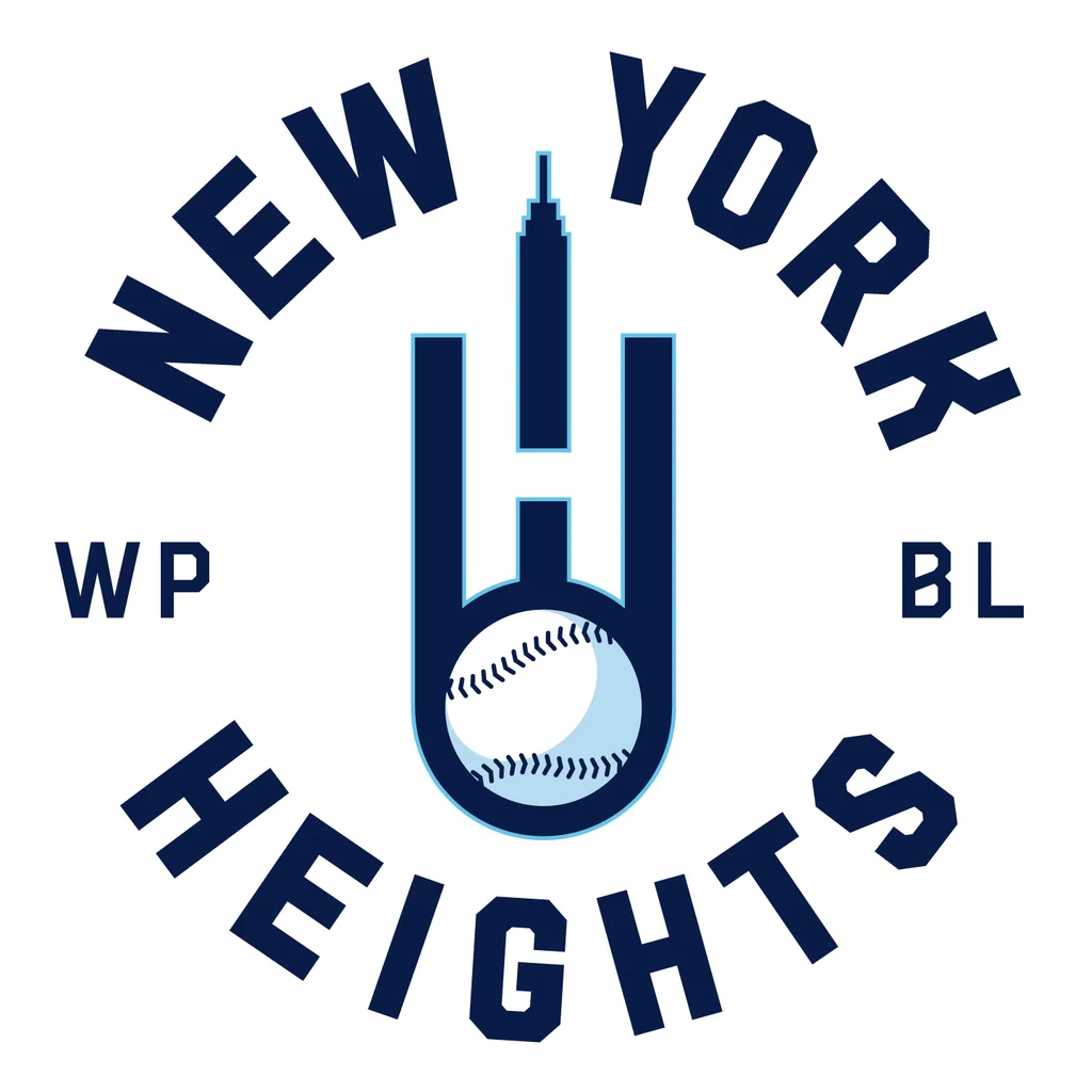
The other teams depart from the traditional baseball icons and bring in more modern styles. Take the New York Heights design, which blends modernist architecture with baseball through vector design that depicts the NYC skyline as well as a fastball motion with upward lines. Using the negative space, the logo displays an “H” at its center.
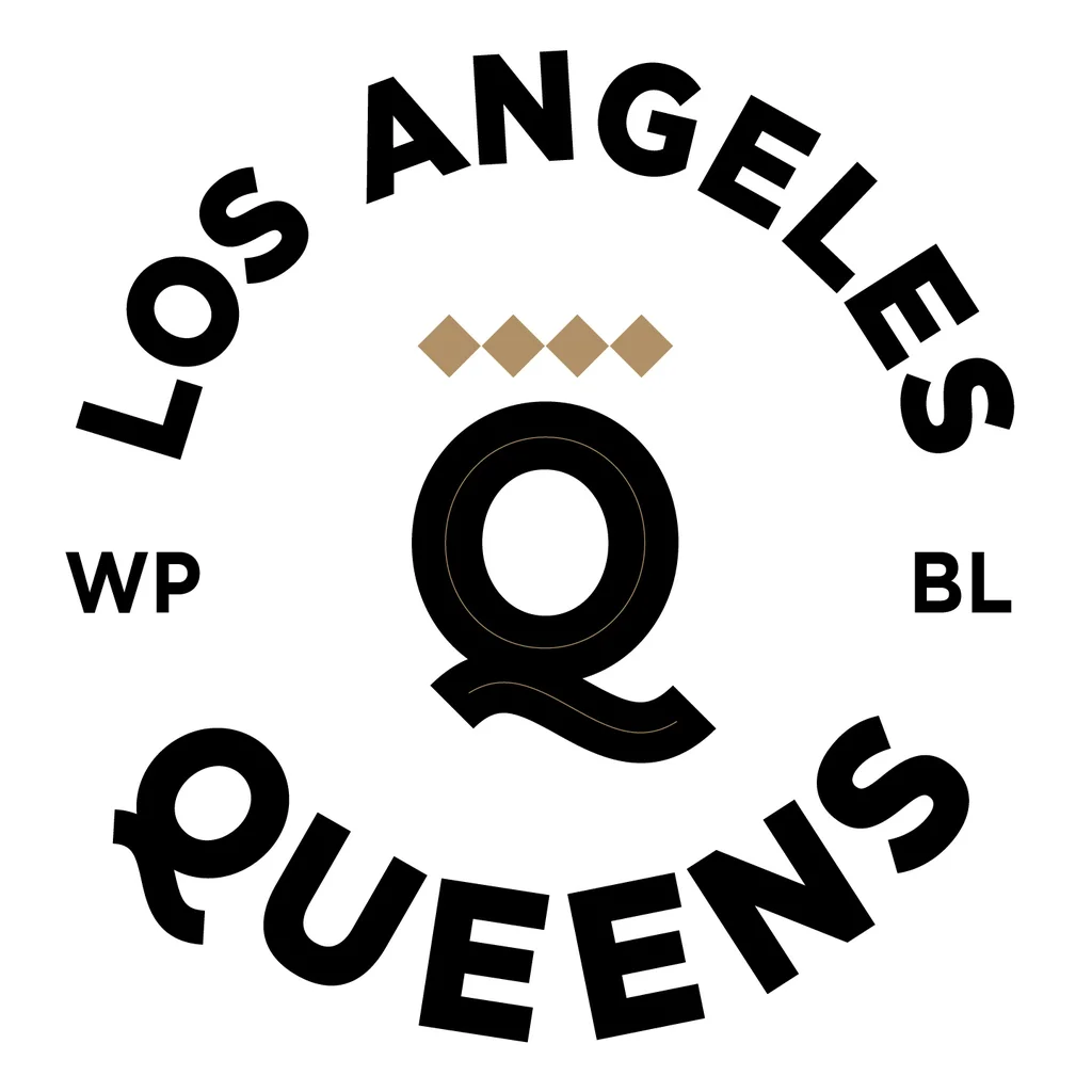
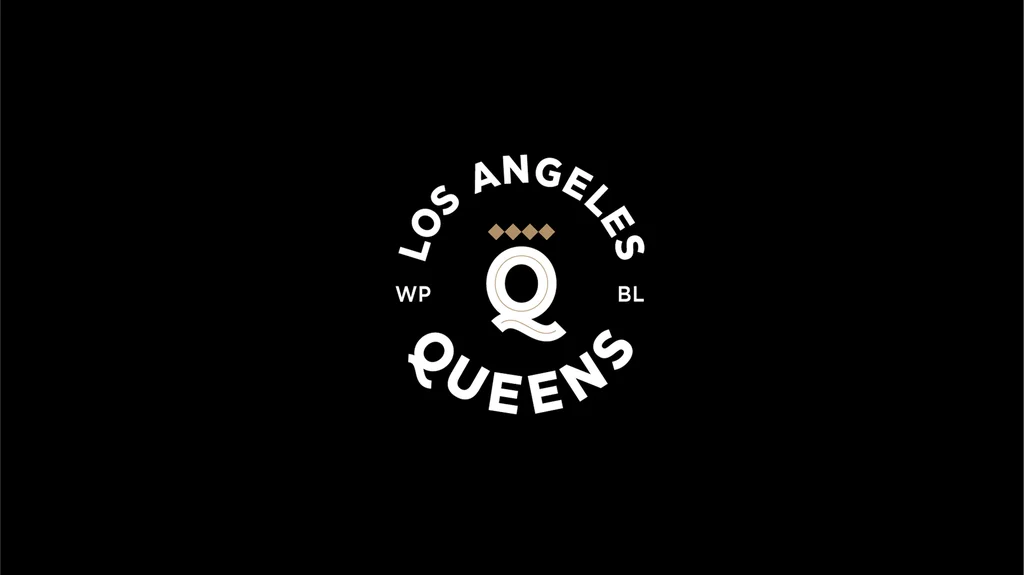
For the Los Angeles Queens, the agency played on the geometry of the field’s shape. Four baseball diamonds are then used to create a sort of crown that is placed on top of a “Q” as “an abstract entry into royalty,” MacEachern says.
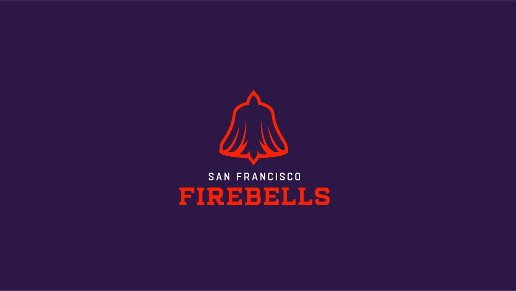
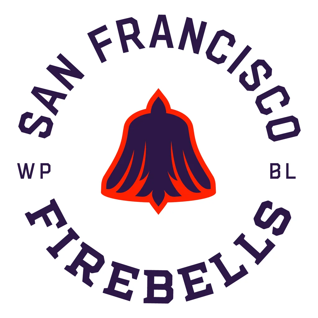
Lastly, the San Francisco Firebells bring in a local icon through color. Using International Orange, the color of the Golden Gate Bridge, as a standout against a purple background, the logo features a fire bell with orange flames licking up, with the negative space outlining the shape of a phoenix.
Beyond the logos, Arrivals + Departures also designed the teams’ uniforms. In contrast to past uniforms like the skirt versions featured in A League of Their Own, the new uniforms have a traditional pants and shirt combo.
With the teams now officially launched, and players out on the field, both the agency and the WPBL can finally see the vision come to life.
“We were conscious from the get-go that when you’re designing a brand new sports league and products for a team from scratch, you’re tasked with building instant history,” said MacEachern at Arrivals + Departures.