Close Menu
    Facebook X (Twitter) Instagram
    TRENDING :
    • Jif’s new logo is a rebrand done right
    • As weather gets harder to predict, which iPhone weather app is best?
    • This 1 high school class is worth $100,000—and most students still don’t take it
    • Why stability might be the smartest career move right now
    • Who is pointing out your blind spots?
    • Jimmy John’s and Buffalo Wild Wings Open First Co-Branded Site
    • The Power of Warm Introductions in Business
    • Why Your Top Performers Quit Right After Their Biggest Wins (and How to Prevent It)
    Compatriot Chronicle
    • Home
    • US Politics
    • World Politics
    • Economy
    • Business
    • Headline News
    Compatriot Chronicle
    Home»Business»Jif’s new logo is a rebrand done right
    Business

    Jif’s new logo is a rebrand done right

    August 15, 20264 Mins Read
    Share Facebook Twitter Pinterest LinkedIn Tumblr Telegram Email Copy Link
    Follow Us
    Google News Flipboard
    Share
    Facebook Twitter LinkedIn Pinterest Email


    Jif just rebranded for the first time in 30 years, and it’s a (rare) example of how to modernize a beloved brand without killing its quirk.

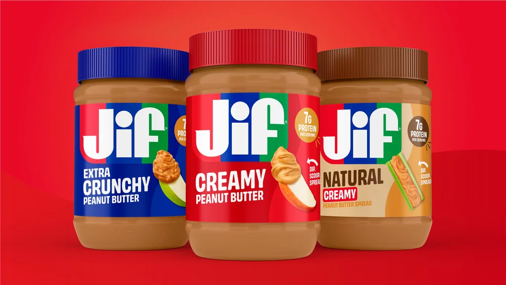
    The updated branding will appear across all of Jif’s products starting this fall, and includes a new wordmark, logo, fonts, and photography. On August 10, Jif dropped a new campaign called “Every Jif’ing Thing,” which highlights the spread’s many use cases—think smoothies, yogurt bowls, and peanut noodles. Together, these efforts are part of a broader repositioning plan from Jif. 

    The brand told Marketing Dive that while 85% of consumers could recognize the Jif logo by its red, blue, and green stripes, they mostly associated it with peanut butter and jelly sandwiches. As Jif works on expanding its product portfolio into new innovations like squeezable tubes and peanut butter and chocolate spread, the brand’s new look is meant to convey that it’s not just a component of your kids’ favorite sandwich—it’s also, per a press release, “a natural complement to an apple slice, rice cake, cracker, or even simply enjoyed from a spoon” (we’ve all been there). 

    In an era when brand refreshes are in vogue, what stands out about Jif’s evolution isn’t what’s changed, but what’s stayed the same. The brand has smartly taken an ultra-subtle approach with its wordmark, and, by staying true to its funky lettering, it manages to look more modern without losing recognizability. 

    [Photo: Jif]

    Jif gets a beyond-PB&J glow-up

    In 2023, Fast Company declared it the era of the “big rebrand.” In 2024, the rebrand was dead, replaced with the “refresh”—ostensibly the same concept, with a lighter, less all-encompassing touch. Today, companies are still much quicker to update their branding in a bid to stay modern than they are to hold off to maintain brand recognizability. 

    When it comes to logos, that can mean sacrificing established brand equity (as in the case of Eddie Bauer, Saint Laurent, and Johnson & Johnson) for the sake of modernity or legibility. Jif—which is one of the brands owned by massive $14 billion food and beverage conglomerate J.M. Smucker—had the built-in advantage that its 30-year-old logo was already in a bold, easy-to-read font (no pesky scripts here). Still, the previous look had plenty of quirks that the brand could easily have smoothed out in service of a sleeker identity.

    The jot above the “i” was comically oversized and squished; the stems of the “J” and “f” were so chunky that only a sliver of space poked in between; and the crossbar of the “f” was disproportionately thin and short. 

    Rather than removing these traits to perfect the logo, the team at Jif opted instead for less-invasive tweaks. The new version looks largely the same, just without a drop shadow or serifs. 

    “For all of our brands, we focus on representing them in a manner that is authentic to the brand, their history, and what they mean to consumers,” says Kara Buckler, senior director of creative and design at J.M. Smucker. “With the Jif refresh, we honored the iconic elements people know and love while also invigorating the brand with a cleaner, bolder look.”

    To signal its repositioning, Jif is relying on the packaging’s new photography to do most of the heavy lifting. Across various SKUs, images of spreads on rice crackers, apples, celery, and pretzels help cue customers in on Jif’s beyond-PB&J glow-up. Its tricolor logo has also been reduced in size so that each SKU is defined by its own distinct label color. 

    The new Jif winks at the brand’s broadening ambitions without alienating its cross-generational fans. It’s a reminder that oftentimes the best rebrands are about restraint.


    Source link

    Share. Facebook Twitter Pinterest LinkedIn Tumblr Email

    Related Posts

    As weather gets harder to predict, which iPhone weather app is best?

    August 15, 2026

    This 1 high school class is worth $100,000—and most students still don’t take it

    August 15, 2026

    Why stability might be the smartest career move right now

    August 15, 2026
    Top News

    26-Year-Old’s Bookkeeping Side Hustle Earns $2,800 a Month

    By Staff WriterJuly 24, 2026

    Key Takeaways Robles found inspiration for her bookkeeping side hustle while scrolling on Facebook. She…

    Beware Of February Onward | Armstrong Economics

    February 1, 2026

    There’s a Small Window to Become the Default Answer in AI Search — Claim It Before Your Competitors Do

    July 31, 2026

    Google’s Pinpoint is the free research tool you should know about

    June 13, 2026
    Top Trending

    Jif’s new logo is a rebrand done right

    By Staff WriterAugust 15, 2026

    Jif just rebranded for the first time in 30 years, and it’s…

    As weather gets harder to predict, which iPhone weather app is best?

    By Staff WriterAugust 15, 2026

    Ask people which app they use most frequently on their phones, and…

    This 1 high school class is worth $100,000—and most students still don’t take it

    By Staff WriterAugust 15, 2026

    A Baylor College of Medicine pediatrician just told Texas lawmakers that “high school seniors…

    Categories
    • Business
    • Economy
    • Headline News
    • Top News
    • US Politics
    • World Politics
    About us

    The Populist Bulletin serves as a beacon for the populist movement, which champions the interests of ordinary citizens over the agendas of the powerful and entrenched elitists. Rooted in the belief that the voices of everyday workers, families, and communities are often drowned out by powerful people and institutions, it delivers straightforward, unfiltered, compelling, relatable stories that resonate with the values of the American public.

    The Populist Bulletin was founded with a fervent commitment to inform, inspire, empower and spark meaningful conversations about the economy, business, politics, inequality, government accountability and overreach, globalization, and the preservation of American cultural heritage.

    The site offers a dynamic mix of investigative journalism, opinion editorials, and viral content that amplify populist sentiments and deliver stories that echo the concerns of everyday Americans while boldly challenging mainstream narratives that serve the privileged few.

    Top Picks

    Jif’s new logo is a rebrand done right

    August 15, 2026

    As weather gets harder to predict, which iPhone weather app is best?

    August 15, 2026

    This 1 high school class is worth $100,000—and most students still don’t take it

    August 15, 2026
    Categories
    • Business
    • Economy
    • Headline News
    • Top News
    • US Politics
    • World Politics
    Copyright © 2025 Populist Bulletin. All Rights Reserved.

    Type above and press Enter to search. Press Esc to cancel.