Close Menu
    Facebook X (Twitter) Instagram
    TRENDING :
    • How Lime redesigned its e-bikes to make them easier for more people to ride
    • This new interactive map shows which NYC blocks are most vulnerable to flooding
    • Did Anthropic just soft-launch the scariest AI model yet?
    • As the iPod makes a comeback, here are some pointers to use it
    • Greece – Energy Protests Worldwide
    • 7 words and phrases that undermine your authority
    • Inflation Was Already Rising Before The War – Now The Real Surge Begins
    • Travelers see fewer flights and higher airfares as jet fuel prices swing
    Compatriot Chronicle
    • Home
    • US Politics
    • World Politics
    • Economy
    • Business
    • Headline News
    Compatriot Chronicle
    Home»Business»The Trump administration just gave the food pyramid a Sweetgreen makeover
    Business

    The Trump administration just gave the food pyramid a Sweetgreen makeover

    January 7, 20263 Mins Read
    Share Facebook Twitter Pinterest LinkedIn Tumblr Telegram Email Copy Link
    Follow Us
    Google News Flipboard
    Share
    Facebook Twitter LinkedIn Pinterest Email


    President Donald Trump’s administration has introduced a new, inverted food pyramid with fewer food groups.

    The new three-section food pyramid is part of the administration’s new nutrition policy announced Wednesday, which encourages Americans to eat whole or minimally processed foods, which it calls “real food,” and has been a long time interest of Health and Human Services Secretary Robert F. Kennedy Jr.

    Kennedy’s policy interests also shine through on the initiative’s new website, realfood.gov, which features copy that reads like a MAHA manifesto. The National Design Studio gave the website a minimalist design that takes cues from consumer companies like Chobani and Sweetgreen, with clean, sans serif typefaces and playful illustrations.

    The new pyramid

    The original pyramid, released by the U.S. Department of Agriculture (USDA) in 1992, featured six sections. The new version is flipped and has three: protein, dairy, and healthy fats; vegetables and fruits; and whole grains. Sweets have been removed.

    [Image: USDA]

    “It’s upside-down, a lot of people would say,” Kennedy said at a White House press conference. “But it was actually upside-down before, and we just righted it.”

    The new pyramid graphic makes do with fewer groups by combining categories from the original food pyramid. Whole grains, once included in the base of the original pyramid, now make up the smallest portion of the new version, while old categories—fruits and vegetables, and meat and dairy—are combined.

    [Image: USDA]

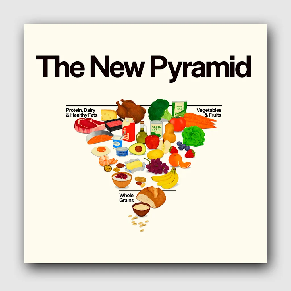
    The graphic is colorful, with eye-catching, painterly illustrations of example foods that might appear in a 1970s health food magazine. But the infographic is less successful as a piece of communication design. It’s not clear how literally the placement of foods within the graphic is meant to be. And although supporting documents about the new pyramid offer specific guidelines, like suggesting saturated fat consumption shouldn’t exceed 10% of total daily calories, the new pyramid doesn’t communicate specifics itself.

    Users can hover over each section of the pyramid for additional information, but it doesn’t provide much. The pyramid doesn’t indicate how many servings of dairy or healthy fats you should have. And to determine your protein target, realfood.gov asks Americans to take on the additional step of first calculating their weight in kilograms. (Quite frankly, we don’t know what that is.)

    The federal government’s new guidance, which gets updated every five years, also removes specific recommendations about daily alcohol consumption and only suggests to drink less. It also calls for more protein and full-fat dairy.

    Government designers have worked to improve upon the food pyramid before. In 2005, an updated graphic made the food segments slice upwards instead of dividing the shape horizontally. In 2011, it ditched the pyramid altogether for MyPlate, a skeuomorphic representation of dietary guidelines that used a circular graphic to represent portions as they’d appear on a plate.

    The new 2026 pyramid represents the Trump administration’s “Make America Healthy Again” priorities under Kennedy’s Health Department and comes two days after the agency cut its number of recommended vaccines for children, worrying medical groups.

    The new recommendations are not meant to be a strict diet, according to its website, but “a flexible framework meant to guide better choices.” It’s minimalist, for sure, but whether Americans find it a useful guide to healthy living remains to be seen.


    Source link

    Share. Facebook Twitter Pinterest LinkedIn Tumblr Email

    Related Posts

    How Lime redesigned its e-bikes to make them easier for more people to ride

    April 10, 2026

    This new interactive map shows which NYC blocks are most vulnerable to flooding

    April 10, 2026

    Did Anthropic just soft-launch the scariest AI model yet?

    April 10, 2026
    Top News

    Grab This $190 MacBook Air for Travel, Meetings, and Working on the Go

    By Staff WriterSeptember 21, 2025

    Disclosure: Our goal is to feature products and services that we think you’ll find interesting…

    Who Americans Usually Blame After Showdowns Over Federal Spending

    August 18, 2025

    Tesla now has cheaper Model Y and 3 cars, but are they still too expensive?

    October 7, 2025

    Email Isn’t Dead — But Your Strategy Might Be. Here’s How to Revive It

    September 9, 2025
    Top Trending

    How Lime redesigned its e-bikes to make them easier for more people to ride

    By Staff WriterApril 10, 2026

    For those of us not born tall and strong, using a shared…

    This new interactive map shows which NYC blocks are most vulnerable to flooding

    By Staff WriterApril 10, 2026

    With most of New York City surrounded by water, climate change poses…

    Did Anthropic just soft-launch the scariest AI model yet?

    By Staff WriterApril 10, 2026

    Welcome to AI Decoded, Fast Company’s weekly newsletter that breaks down the most important news…

    Categories
    • Business
    • Economy
    • Headline News
    • Top News
    • US Politics
    • World Politics
    About us

    The Populist Bulletin serves as a beacon for the populist movement, which champions the interests of ordinary citizens over the agendas of the powerful and entrenched elitists. Rooted in the belief that the voices of everyday workers, families, and communities are often drowned out by powerful people and institutions, it delivers straightforward, unfiltered, compelling, relatable stories that resonate with the values of the American public.

    The Populist Bulletin was founded with a fervent commitment to inform, inspire, empower and spark meaningful conversations about the economy, business, politics, inequality, government accountability and overreach, globalization, and the preservation of American cultural heritage.

    The site offers a dynamic mix of investigative journalism, opinion editorials, and viral content that amplify populist sentiments and deliver stories that echo the concerns of everyday Americans while boldly challenging mainstream narratives that serve the privileged few.

    Top Picks

    How Lime redesigned its e-bikes to make them easier for more people to ride

    April 10, 2026

    This new interactive map shows which NYC blocks are most vulnerable to flooding

    April 10, 2026

    Did Anthropic just soft-launch the scariest AI model yet?

    April 10, 2026
    Categories
    • Business
    • Economy
    • Headline News
    • Top News
    • US Politics
    • World Politics
    Copyright © 2025 Populist Bulletin. All Rights Reserved.

    Type above and press Enter to search. Press Esc to cancel.