Close Menu
    Facebook X (Twitter) Instagram
    TRENDING :
    • How to Make Money on Social Media Without a Huge Following
    • 28-Year-Old’s Side Hustle Hit $125K in Year 1: More Than Matcha
    • How to Speak Honestly at Work Without Derailing Your Career
    • Silicon Valley Doesn’t Have a Monopoly on Startup Wisdom
    • The EU Will Block Peace Between Russia & Ukraine
    • Laid-Off Marketer’s Apartment-Made Pizzas Sell Out in 30 Seconds
    • 4 Questions That Separate Real Founders From Performers
    • $14 Billion Company Is Giving 7,000 Employees a Day Off to Game
    Compatriot Chronicle
    • Home
    • US Politics
    • World Politics
    • Economy
    • Business
    • Headline News
    Compatriot Chronicle
    Home»Business»This long-forgotten signage from Argentina is World Cup design at its best
    Business

    This long-forgotten signage from Argentina is World Cup design at its best

    June 27, 20263 Mins Read
    Share Facebook Twitter Pinterest LinkedIn Tumblr Telegram Email Copy Link
    Follow Us
    Google News Flipboard
    Share
    Facebook Twitter LinkedIn Pinterest Email


    When designers for the 1978 World Cup in Argentina designed a signage and wayfinding system for the tournament, they needed something that would be easy to read and scale. Their forgotten work was ingenious and economical—and it’s finally getting its due.

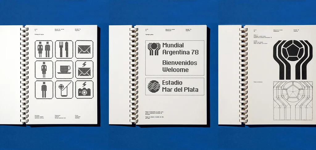
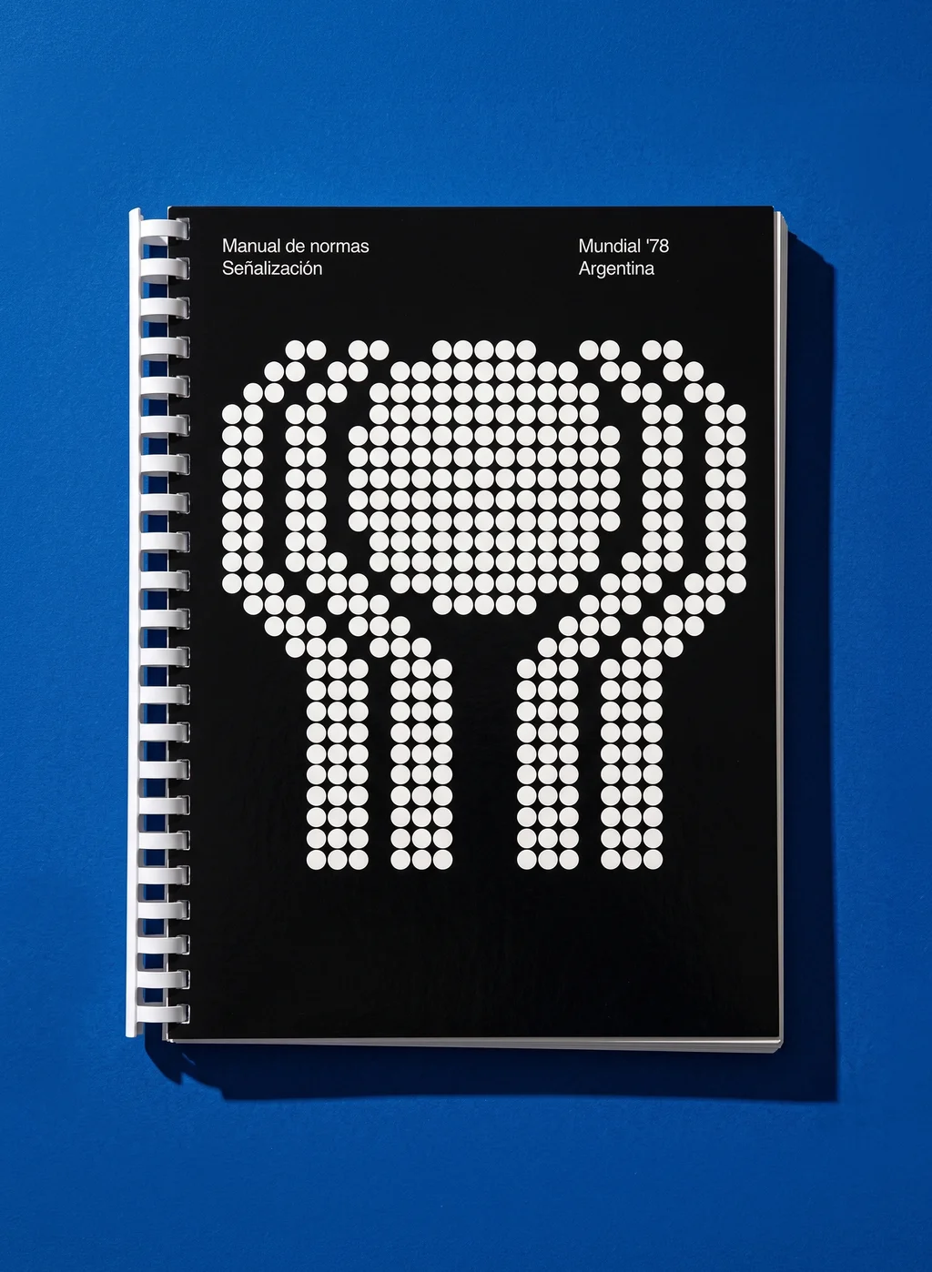
    A new book takes a look back at Argentina’s World Cup signage system through the instruction manual that put it all together. Manual of Standards: Signage, FIFA World Cup ’78 Argentina faithfully reproduces that original standards manual, and it allows for a close look at a fascinating rendition of pre-digital wayfinding. The system took a grid-based approach, but was also completely modular: made from buttons affixed in patterns on a perforated panel to make shapes, symbols, and letters.

    [Photo: Flecha Books]

    And yet, despite being among the largest sporting events in South America in the 20th century, the 1978 World Cup design system has been largely forgotten. That might have something to do with the military dictatorship that ruled the country up until 1983, and a collective desire to leave it in the past—a kind of anti-nostalgia.

    Now, publisher Flecha Books is hoping to draw attention back to the designers’ work. The book, printed to the same standards as the original, is available for preorder until July 19 for $55.
    [Photo: Flecha Books]

    “In the last century, almost every sports event has been revisited from a design point of view, especially the Olympics, but also a few World Cups,” graphic designer and Flecha Books cofounder Francisco Roca tells Fast Company. “This was one of the largest sports events in South America at the time and also the first Argentinian systematic design solution or work for a large event, so it’s kind of special.”

    Though unique, this wasn’t the first World Cup brand or wayfinding system. For that year’s tournament, though, organizers needed a standardized signage system that could be deployed across six venues that would be cheap to produce in large volumes. The solution was the system outlined in the standards manual and called Puntograma, Spanish for “dot-a-gram” or “point-a-gram,” a comprehensive grid-based system that workers on-site at stadiums could assemble themselves.

    [Photo: Flecha Books]

    Puntograma used a modular grid on dark green perforated steel panels that were manually assembled with individual white polypropylene buttons inserted into the perforations to make a cohesive shape or image, like a Lite-Brite toy. There were also red buttons reserved for warnings.

    The system was designed by designers Carlos Méndez Mosquera and Gus Bonsiepe at the Argentine studio MM/B. The firm also handled the rest of the 1978 World Cup’s industrial design, including seating and venue equipment. That industrial design mindset found its way into their modular, scalable signage.

    [Photo: Flecha Books]

    The comprehensive graphic system for the 1978 World Cup used a typeface that took its proportions from the sans serif Univers, set at 80% height, which Roca says they’re working to recreate as a font.

    It also included arrows; pictograms for restrooms, restaurants, cafés, and other amenities; and logos for each stadium. For the venue in Mar del Plata on the coast, for example, the logo featured waves; for Córdoba near the Sierras Chicas mountain range, it showed a mountain; and for Mendoza in Argentina’s wine country, it used grapes.

    “Design-wise, it was a really clever and ingenious and different and approachable solution,” Roca says. And now it’s getting a much-deserved closer look.


    Source link

    Share. Facebook Twitter Pinterest LinkedIn Tumblr Email

    Related Posts

    How to Make Money on Social Media Without a Huge Following

    November 12, 2026

    28-Year-Old’s Side Hustle Hit $125K in Year 1: More Than Matcha

    November 12, 2026

    How to Speak Honestly at Work Without Derailing Your Career

    November 12, 2026
    Top News

    Trump’s arrival in Davos off to a bumpy start, as his quest for Greenland could take center stage

    By Staff WriterJanuary 21, 2026

    President Donald Trump arrived at the World Economic Forum in Davos, Switzerland, on Wednesday, after…

    The Perks Workers Want Also Make Them More Productive

    August 17, 2025

    People Are Letting AI Agents Manage Their Stock Portfolios Now

    September 11, 2026

    The older you get, the harder it is to make friends at work. Here’s why

    April 24, 2026
    Top Trending

    How to Make Money on Social Media Without a Huge Following

    By Staff WriterNovember 12, 2026

    Key Takeaways Follower count is a vanity metric. Trust and engagement are…

    28-Year-Old’s Side Hustle Hit $125K in Year 1: More Than Matcha

    By Staff WriterNovember 12, 2026

    Key Takeaways Goldwasser leveraged her marketing and consulting experience to build More…

    How to Speak Honestly at Work Without Derailing Your Career

    By Staff WriterNovember 12, 2026

    Key Takeaways There’s such a thing as being too honest in the…

    Categories
    • Business
    • Economy
    • Headline News
    • Top News
    • US Politics
    • World Politics
    About us

    The Populist Bulletin serves as a beacon for the populist movement, which champions the interests of ordinary citizens over the agendas of the powerful and entrenched elitists. Rooted in the belief that the voices of everyday workers, families, and communities are often drowned out by powerful people and institutions, it delivers straightforward, unfiltered, compelling, relatable stories that resonate with the values of the American public.

    The Populist Bulletin was founded with a fervent commitment to inform, inspire, empower and spark meaningful conversations about the economy, business, politics, inequality, government accountability and overreach, globalization, and the preservation of American cultural heritage.

    The site offers a dynamic mix of investigative journalism, opinion editorials, and viral content that amplify populist sentiments and deliver stories that echo the concerns of everyday Americans while boldly challenging mainstream narratives that serve the privileged few.

    Top Picks

    How to Make Money on Social Media Without a Huge Following

    November 12, 2026

    28-Year-Old’s Side Hustle Hit $125K in Year 1: More Than Matcha

    November 12, 2026

    How to Speak Honestly at Work Without Derailing Your Career

    November 12, 2026
    Categories
    • Business
    • Economy
    • Headline News
    • Top News
    • US Politics
    • World Politics
    Copyright © 2025 Populist Bulletin. All Rights Reserved.

    Type above and press Enter to search. Press Esc to cancel.