Close Menu
    Facebook X (Twitter) Instagram
    TRENDING :
    • 28-Year-Old’s Side Hustle Hit $125K in Year 1: More Than Matcha
    • How to Speak Honestly at Work Without Derailing Your Career
    • Silicon Valley Doesn’t Have a Monopoly on Startup Wisdom
    • The EU Will Block Peace Between Russia & Ukraine
    • Laid-Off Marketer’s Apartment-Made Pizzas Sell Out in 30 Seconds
    • 4 Questions That Separate Real Founders From Performers
    • $14 Billion Company Is Giving 7,000 Employees a Day Off to Game
    • Why Consumers Are Paying to Participate, Not Just to Consume
    Compatriot Chronicle
    • Home
    • US Politics
    • World Politics
    • Economy
    • Business
    • Headline News
    Compatriot Chronicle
    Home»Business»CNBC replaces its peacock with . . . a triangle
    Business

    CNBC replaces its peacock with . . . a triangle

    December 13, 20252 Mins Read
    Share Facebook Twitter Pinterest LinkedIn Tumblr Telegram Email Copy Link
    Follow Us
    Google News Flipboard
    Share
    Facebook Twitter LinkedIn Pinterest Email


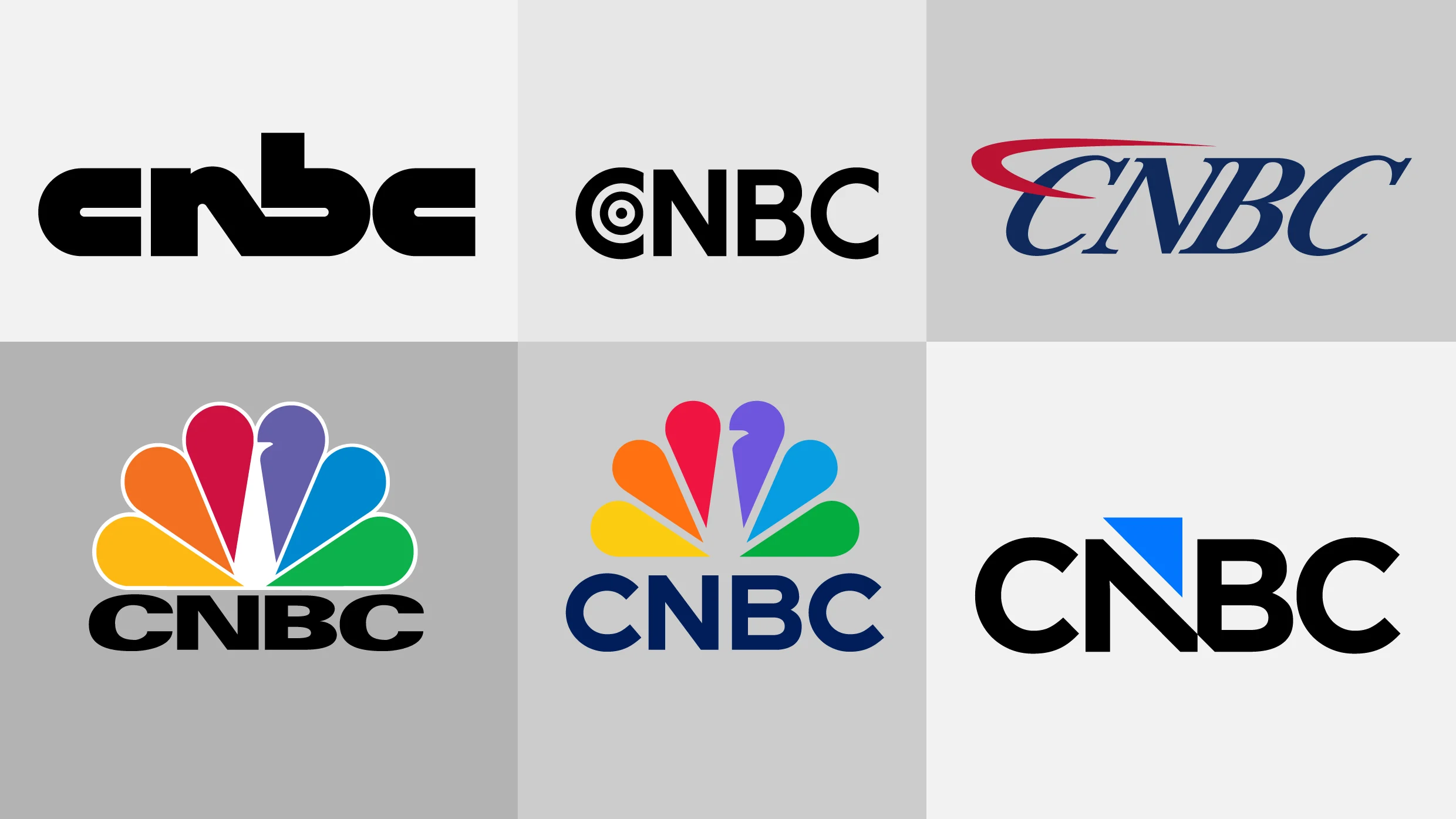
    CNBC and its sister networks, including USA, Golf Channel, and E!, are spinning off from their former parent company Comcast NBCUniversal to form a new publicly traded company called Versant. As part of the new company, some of the brands in the portfolio have to rebrand to get rid of NBC’s iconic Peacock mark, CNBC included.

    CNBC’s new logo, which goes live December 13, might take viewers some time to get used to.

    CNBC’s logo evolution, 1989–present. [Images: CNBC]

    The financial news network’s new logo was designed in house to easily match the preexisting visual assets it uses on air. The typography of the mark based is on the network’s font, Gotham, and it shows a triangle cutting into the letter N and floating just above the wordmark. That triangle, which the network calls an arrow, matches its on-air graphics package.

    The triangle shape has been used by CNBC since 2023. It’s shown next to stocks to indicate which companies are up in green and which are down in red, and it appears as an icon displayed next to on-air chyrons like “Earnings Report.” The colors used in the new logo match the the dark “Broadcast Blue” and light “Neon Blue” already used in the network’s primary color palette.

    The new logo is meant to reflect a modern, streamlined identity, CNBC says, but the initial reaction online to the new logo hasn’t exactly been positive. In one Reddit thread, complaints ranged from “generic” and “corporate-looking” to being bothered by the triangular notch at the bottom of the N and B. “The triangle represents a guillotine blade, killing the brand,” one wrote. On X, a commenter asked if it was a joke.

    Though the peacock is gone, CNBC is betting that by sticking to its arrow and wordmark it will be able to maintain the strength and recognition of its name brand with its audience even with a new look.


    Source link

    Share. Facebook Twitter Pinterest LinkedIn Tumblr Email

    Related Posts

    28-Year-Old’s Side Hustle Hit $125K in Year 1: More Than Matcha

    November 12, 2026

    How to Speak Honestly at Work Without Derailing Your Career

    November 12, 2026

    Silicon Valley Doesn’t Have a Monopoly on Startup Wisdom

    November 12, 2026
    Top News

    Why Begging to Be Chosen Makes You Easier to Reject

    By Staff WriterNovember 5, 2026

    Opinions expressed by Entrepreneur contributors are their own. Key Takeaways We see students cram every…

    Snap CEO Spiegel Thinks You’ll Pay $2,195 for This Smart Device

    September 3, 2026

    Domino’s tasty new tagline is a jingle and logo rolled into one

    October 9, 2025

    Job Future Unclear for Rhode Island Prosecutor Seen Berating Police and Flauting Her Position in Viral Arrest Video | The Gateway Pundit

    August 23, 2025
    Top Trending

    28-Year-Old’s Side Hustle Hit $125K in Year 1: More Than Matcha

    By Staff WriterNovember 12, 2026

    Key Takeaways Goldwasser leveraged her marketing and consulting experience to build More…

    How to Speak Honestly at Work Without Derailing Your Career

    By Staff WriterNovember 12, 2026

    Key Takeaways There’s such a thing as being too honest in the…

    Silicon Valley Doesn’t Have a Monopoly on Startup Wisdom

    By Staff WriterNovember 12, 2026

    Opinions expressed by Entrepreneur contributors are their own. Key Takeaways Founders in…

    Categories
    • Business
    • Economy
    • Headline News
    • Top News
    • US Politics
    • World Politics
    About us

    The Populist Bulletin serves as a beacon for the populist movement, which champions the interests of ordinary citizens over the agendas of the powerful and entrenched elitists. Rooted in the belief that the voices of everyday workers, families, and communities are often drowned out by powerful people and institutions, it delivers straightforward, unfiltered, compelling, relatable stories that resonate with the values of the American public.

    The Populist Bulletin was founded with a fervent commitment to inform, inspire, empower and spark meaningful conversations about the economy, business, politics, inequality, government accountability and overreach, globalization, and the preservation of American cultural heritage.

    The site offers a dynamic mix of investigative journalism, opinion editorials, and viral content that amplify populist sentiments and deliver stories that echo the concerns of everyday Americans while boldly challenging mainstream narratives that serve the privileged few.

    Top Picks

    28-Year-Old’s Side Hustle Hit $125K in Year 1: More Than Matcha

    November 12, 2026

    How to Speak Honestly at Work Without Derailing Your Career

    November 12, 2026

    Silicon Valley Doesn’t Have a Monopoly on Startup Wisdom

    November 12, 2026
    Categories
    • Business
    • Economy
    • Headline News
    • Top News
    • US Politics
    • World Politics
    Copyright © 2025 Populist Bulletin. All Rights Reserved.

    Type above and press Enter to search. Press Esc to cancel.